Comune di Parma
With commitment and honor, we directed the restyling of the Parma city blazon and its visual identity system. The project began with studying and analyzing the history of the heraldic coat of arms of the city of Parma, examining all its changes and variations over the years.


Every original component was redesigned with a new graphic design through simplification and iconographic modernization. The genesis of this design is rooted in the preservation of broad dimensions and hierarchies, while also extracting every detail from the previous brand to evoke a ‘déjà vu’ effect at first sight.


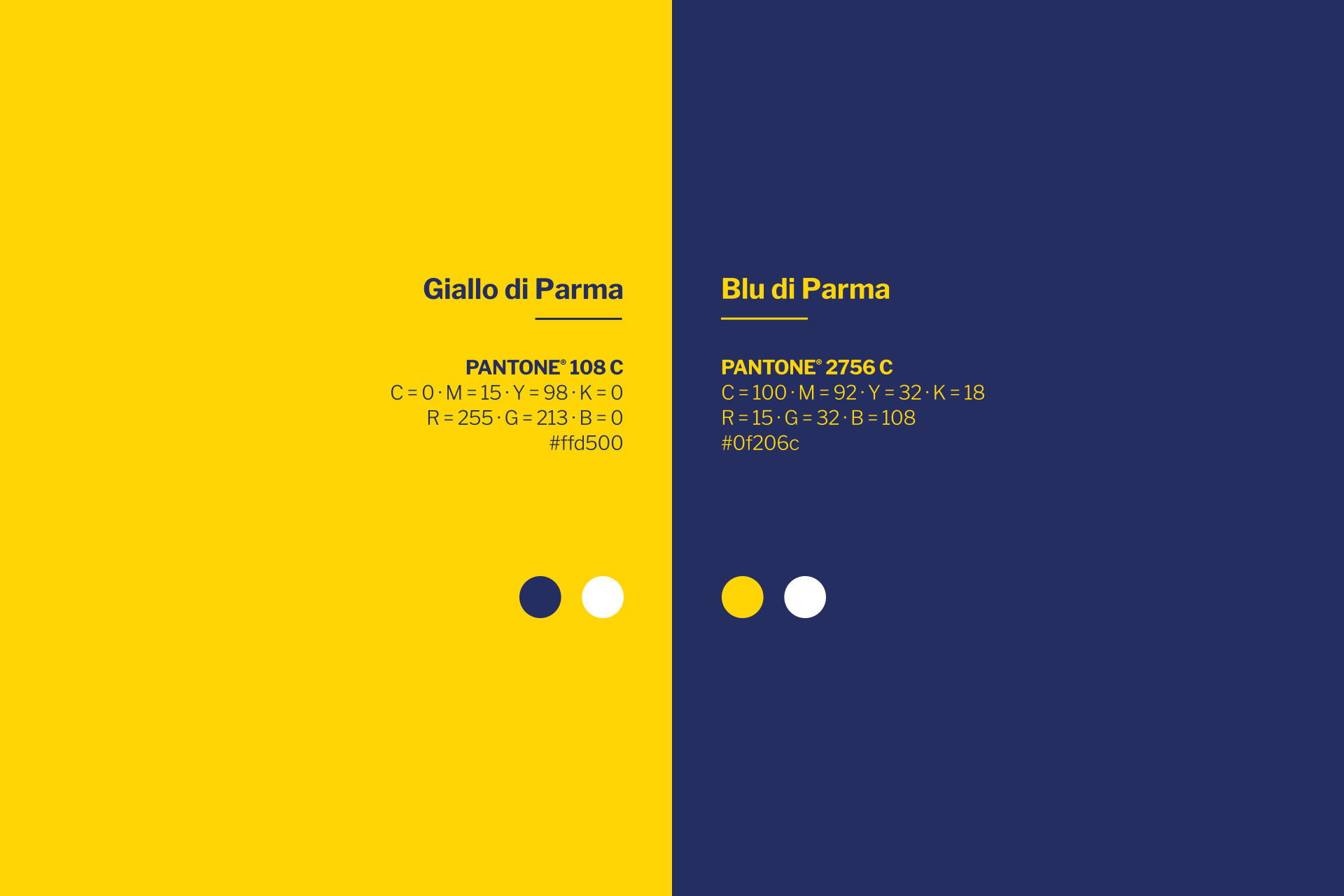
The color scheme and choices aim to reinforce the City’s identity and foster a sense of belonging among its citizens. We synthesized all the constituent elements in blue, leaving the golden yellow shield as the only solid field.
Bodoni Roman was chosen to represent the institution, paired with Franklin Gothic to create a complete institutional kit. This was a fitting tribute and a deliberate choice.


In its most institutional guise, Parma must express its culinary heritage, as it is a UNESCO Creative City of Gastronomy. With this in mind, we conceived a visual identity system that reflects a true recipe: 39% yellow, 47% blue, and 14% white. This balance allows for the creation of any communication material, whether in two-dimensional or three-dimensional form.


